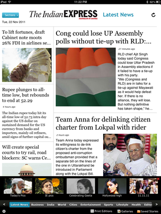
Indian Express joins the ranks of IBN Live, Deccan Chronicle, Times of India, Hindustan Times, NDTV, IBN Live and Firstpost to have released an iPad app. The app is a free download and was developed by Mediology, not Robosoft (thank god).
Indian Express app opens up to the home page with a 2-pane view. The left most pane is  a quick news corner with the image and a tap on which takes you to the actual story. The right side of the screen house 2 main stories and tapping on them takes to the actual story.
Sections to browse through the paper are provided at the bottom as a horizontal scroll bar. The same result can be achieved by the drop down list provided prominently at the top left corner. You can quickly jump to Editorials, if that is your thing or dart straight to the sports section to find about the next biggest scam in cricket.
What’s working well?
- Each story can be saved for offline reading, within the app.
- One can move from one story to another story seamlessly within a section.
- The UI is clean, neat and simple. No learning curve at all.
- Galleries provides a way to scroll through the stories through images.
What could be better?
- No smooth scrolling : Scrolling is old fashioned on the Indian Express app. Scrolling is by page level. For example, if you scroll with your finger, the screen immediately moves to the next set of stories. There’s way to stop in the middle.
- No landscape : This is by far the biggest let down of the app. The app just doesn’t load into landscape.
- The sharing buttons are really tiny. There is no exclusive sharing to social media sites like Twitter and Facebook.
- The scrolling of the two panes can be independent like what we have seen in the FirstPost iPad app.
Indian Express iPad app is neatly done though it can use a quick revision to fix the quirks pointed out. Unlike Times of India app, Indian Express iPad app is quite liberal in letting the reader enjoy the story in full screen.
Also check out our 5 must have India news apps for your iPad


![Indian Express iPad app [review]](https://thegadgetfan.com/wp-content/uploads/2011/11/zenbook_wp2_1600_thumb.jpg)
![Indian Express iPad app [review]](https://thegadgetfan.com/wp-content/uploads/2011/11/GFIVEG616_thumb.jpg)


