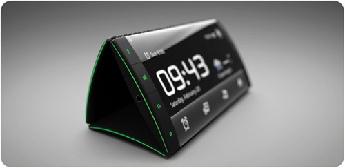
How do you differentiate in this mad smartphone world? Everyone is differentiating with a faster and bigger phone and not necessarily a better phone. No one, except Apple, is thinking about what matters the most : user experience. This concept phone is trying to address the user experience part. It’s not a “oh there is an app for that” kind of a thing. This much bigger than an app. A significant hardware design change which will probably spawn several new apps, if at all this goes to production.
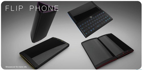
When one is not enough, you get three screens on your phone. And there is a keypad too. The concept phone is incredible way of looking at things. It enhances the screen real estate tremendously. Its unique flip design lets you do more than one thing. Different screens can be used for different purposes. When you are not using the phone, it can be used as a beautiful flower vase. Ain’t that cool?
Now that you have watched the video, I will tell you my most favorite use cases.
- Two people watching the same video or two different videos from the same phone. This is quite a cool feature.
- Though trivial, phone being used as a flower vase.
- The keypad design and the curvy screen design.
- Sharing content by just kissing it with another phone. Like.
- Dragging and dropping content from one screen to another.
A smartphone with a single screen is costing a bomb these days. Though there is a promising trend of the rates going downwards. With three screens, three of them I expect to be capacitive, the phone’s cost will run up quite high. The phone is still a concept and like all things concept phones, this may or may not go to production. There could be several challenges which a design team might have ignored. Those things are something which production houses like Nokia, Samsung and LG have to consider. I really wish this phone reaches the light of the day.
Whoever brings out this phone will get all the glory, though ephemeral.
Source : Idkul

![Triple screen phone [concept]](https://thegadgetfan.com/wp-content/uploads/2011/04/linksysrouter_thumb.jpg)
![Triple screen phone [concept]](https://thegadgetfan.com/wp-content/uploads/2011/05/AEsir_thumb.jpg)
![Top 8 Best 6 GB RAM Mobile Phones [2017]](https://thegadgetfan.com/wp-content/uploads/2016/03/Vernee-Apollo.jpg)
![Top 15 Mobiles With Longest Battery Life [12 hours +]](https://thegadgetfan.com/wp-content/uploads/2014/10/increase-battery-backup-tgf.png)